Some months ago I made a digital experience of a physical project, the postcard wall. Now I’ll share some more information about some of the techniques I used to make the experience.
Priorities & Ideation
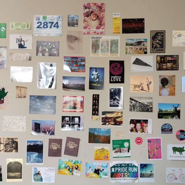
I wanted to give a sense of space in the project — this wall, this practice of putting postcards up on my wall was something I had for 10 years, and the wall in the main photograph was in my main living space for nearly 5, and I took it down and began the project when I moved [many months] after my divorce.
My initial sketches were inspired by some of my favorite interactives, which might be cliché at this point: scrollers where the story emerges as you go. But when I started working on the project again during a hacking session at Never Graduate Week, I realized that if my priority was to give this sense of space, I could try to recreate the wall, and even more so, because you can actually “pick up” cards off the wall to look at them, which you couldn’t wouldn’t do in the physical space.
For technical priorities, I wanted to use as little, vanilla tech as possible. If I could do the whole thing in CSS, it would’ve been (and it very nearly is, there’s <100 lines of JavaScript, and some is prose). My friend Ben has a running bet that the site will be one of the (likely few) digital interactives that still works in 5 years. I have my doubts, but I did use very boring tech and classic techniques to work on my project.
I also wanted the site to be responsive. Somewhat at odds with the “immersive experience” goal, this became my priority when after I sent it to my friend Chad for some comments on the rough draft, his first comment was about it on a phone. Of course, if people share it, the most likely way they’ll first see it, would be on the phone, and prioritizing that early on helped form many technical decisions here.
The Wall/The Background
To make the clickable wall/background, I based my approach on an image map. To make a responsive image map, I used a really neat tool, which reminded me of Em’s !!con talk about tools assisting/inspiring design. As I was making the image map, and realizing that this strategy might just work, deciding how you would “pick up” a postcard by clicking on it became clearer.
But to have the background image in the right spot, that was a bit “woof” according to my notes. Alas, I don’t have much notes here other than “it was hard” and a link to the MDN docs.
The Cards
I wrote and sent the postcards out over the course of two years, documenting the whole time on Instagram. I downloaded my Instagram data via their exporter, but I actually had some better luck in data hunting by downloading the profile page as a webpage (here, I take a moment to continue to emphasize my use of unremarkable tech).
There’s definitely some fancier way of doing this, but I use one image container to have the front/back of the card, and then replace that card when you click on a new one by associating the image map <a> link with a magically named file. Here’s the markup:
<div class="card-wrap">
  <img class="front" srcset="./postcards/berlin_front-480w.jpeg 480w,./postcards/berlin_front-600w.jpeg 600w,./postcards/berlin_front-800w.jpeg 800w" sizes="(max-width: 600px) 480px,(max-width: 1500px) 600px, 800px"
src="./postcards/berlin_front-800w.jpg" alt="Caption goes here">
  <img class="back" srcset="./postcards/berlin_back-480w.jpeg 480w,./postcards/berlin_back-600w.jpeg 600w, ./postcards/berlin_back-800w.jpeg 800w" sizes="(max-width: 600px) 480px,(max-width: 1500px) 600px, 800px"
src="./postcards/berlin_back-800w.jpg" alt="Caption goes here">
</div>
And the JavaScript that does that swapping by attaching an event listener to those <a> tags and updating things based on which image you clicked:
document.querySelectorAll('#wall a').forEach((item, i) => {
  item.addEventListener("click", (e) => {
    e.preventDefault();
    // Update the overlay with this thing's info
    var name = e.target.title;
    var srcset_front = `./postcards/${name}_front-480w.jpeg 480w,./postcards/${name}_front-800w.jpeg 800w`;
    var srcset_back = `./postcards/${name}_back-480w.jpeg 480w,./postcards/${name}_back-800w.jpeg 800w`;
    imgFront.src = `${name}_front-480w.jpeg`;
    imgFront.srcset = srcset_front;
    imgFront.title = e.target.dataset.caption;
    imgFront.alt = e.target.dataset.alt;
    imgBack.src = `${name}_back-480w.jpeg`;
    imgBack.srcset = srcset_back;
    imgBack.title = e.target.dataset.caption;
    instLink.href = e.target.href;
    imgOverlay.classList.add('fadeIn');
  })
});
This is not efficient programming-wise because I’m mutating the elements on the page, but I will counter with this very poignant statement:
So what? It works. [And it’s art]
I used the srcset attribute to specify which images to use under different screen sizes (responsive!!), using ImageMagick’s convert to resize/scale/massage them into what I needed in order to have different image sizes for different resolutions, and scripted this in bash to do it a bunch of times, with one lazy if check to see if I’d already converted, because it took me a few tries to get this conversion going.
# name="$1"

for i in $(ls ./*_back.jpg); do
  name=${i:2}
  name=${name%%_back.jpg}
  if [ ! -f ${name}_front-800w.jpeg ]; then
    echo "Converted file not found! Doing a conversion"
    convert ${name}_back.jpg -resize 800x800 ${name}_back-800w.jpeg
    convert ${name}_front.jpg -resize 800x800 ${name}_front-800w.jpeg
    convert ${name}_front.jpg -resize 600x600 ${name}_front-600w.jpeg
    convert ${name}_back.jpg -resize 600x600 ${name}_back-600w.jpeg
    convert ${name}_back.jpg -resize 480x480 ${name}_back-480w.jpeg
    convert ${name}_front.jpg -resize 480x480 ${name}_front-480w.jpeg
    echo "Converted $name"
  fi
done
Flipping the cards
I first went researching for some cool method to do a “flipping” animation for the cards, and read something that sounded way too complex for what I wanted, so I used CSS-only interactions for placing and showing cards in a way that works straight-forwardly on mobile and desktop.
The front and back images of the card exist in the same markup space in a <div> element. And when you hover over the area, the opacity of the second (back image) switches to 1:
.card-wrap:hover > .back, .card-wrap:active > .back {
  opacity: 1;
}
That’s how the back shows when you hover over the postcard in the overlay. While a flipping animation would be cool, this has the chief benefit of “working” and being understandable to me.
Bonuses and tricks
In finalizing the project into something that could be shared, I tested the social cards to make sure when you shared the link to social (or Slack, etc.) that the embed would look good, and that was tricky as they were a little annoying to debug. The Facebook debugger (which alas, you might need a throwaway FB account in order to use it, as it requires one) for social cards is much better and helpful versus poking around with Twitter to see “does it work yet”.
Finally, one of my favorite small details relates to the introduction text. I added the introduction text inspired by Chad’s suggestion that my vision of “large wall you explore” could use some help, so introduction text fades into your screen over the wall when you open the page, with options to close the text or get more instructions depending on your style. The small detail is that that introduction text may be different every page load (for enhanced spookiness).
Conclusion
At this point it feels time to link again to the live project itself, where you can Inspect Element away if any of this made you curious. And the source is on GitHub.